
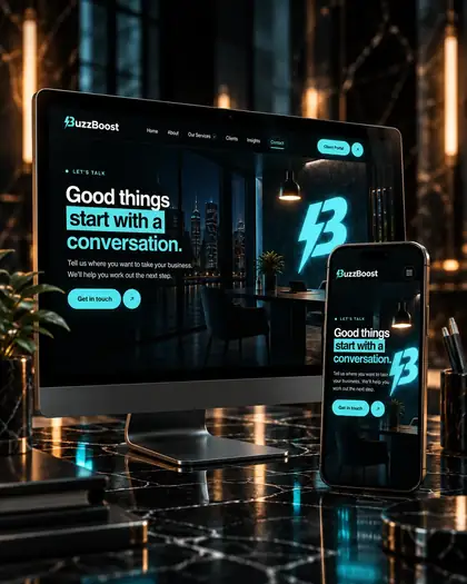
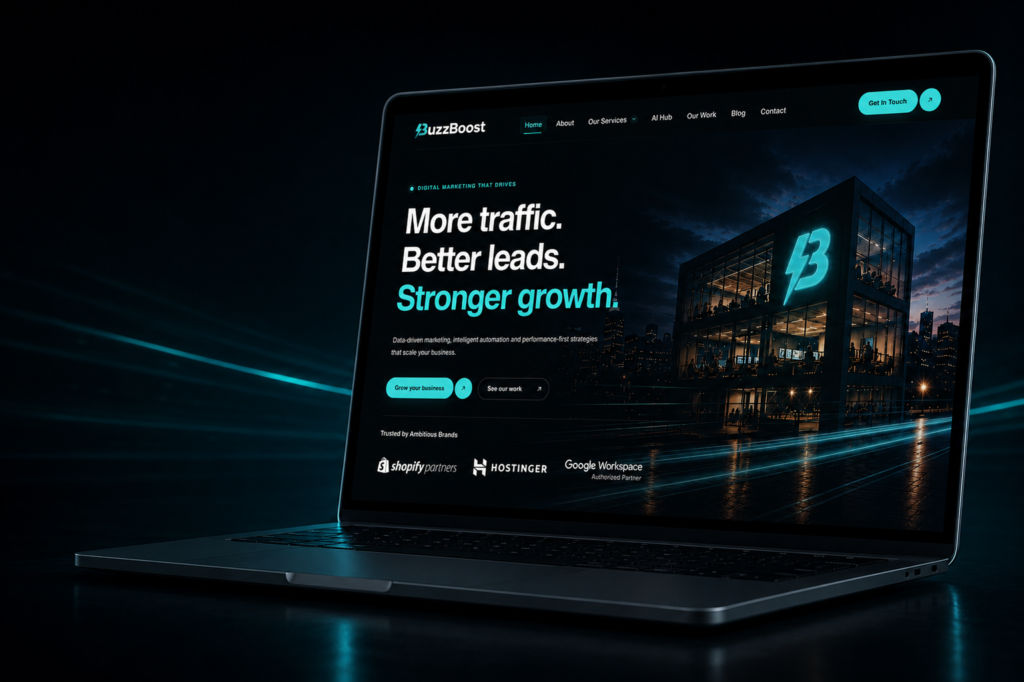









A homepage is usually asked to do too many things. It has to introduce the company, list the services, prove credibility, carry the brand, and persuade someone to make contact. Trying to do all of that at once is how homepages end up saying very little.
Three things, in order
Before anything else, a visitor needs to know what you do, whether it is for someone like them, and what happens if they are interested. If those three are not answerable in the first screen, the rest of the page is working uphill.
Notice that none of the three is “who we are”. That matters, but it is a second-screen question — it is what the about page is for.
Write for the person, not the category
“Digital solutions for ambitious businesses” is a category. It could belong to thousands of companies. The more specific version — what you actually do, for whom, in plain words — is almost always shorter and always clearer.
Specificity feels risky because it excludes people. That is the point: a homepage that excludes the wrong visitors is doing its job.
One primary action
Give the first screen a single primary action, and make every other option visibly secondary. Two equally weighted buttons is a decision handed to someone who has been on the page for four seconds and does not yet have enough information to make it.
Test it the short way
Show the top of your homepage to someone outside your business for five seconds, then take it away and ask what the company does and who it is for. If they cannot answer, the problem is the copy or the hierarchy, not the design.
Do this on a phone as well. The first screen on a phone is much smaller than the one you designed on, and it is where most people will meet you first.
Then let the rest of the page breathe
Once the first screen does its job, the rest can slow down — services, proof, process, contact. The page below the fold is allowed to be longer and more considered, because by then the visitor has chosen to keep going.
If the first screen is the part you are unsure about, that is usually where a web design conversation starts. And if you already know what you want to say but not how to structure it, let’s talk.