








Our WorkSEO Paradise
SEO Paradise.
A white-label partnership.
An Essex SEO and digital marketing agency, and a white-label partner.
Their website.And shared client work.
The challenge
SEO Paradise is an SEO and digital marketing agency based in Essex.
We work together in two ways. We built the SEO Paradise website and manage it, and the two agencies collaborate on selected client projects under a white-label arrangement.
What we did
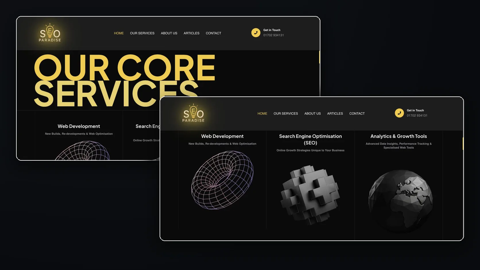
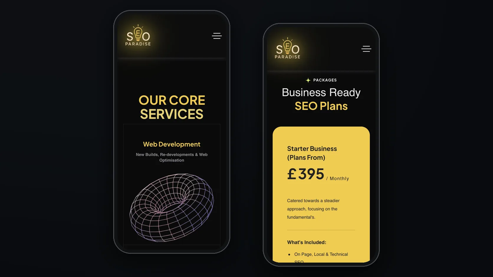
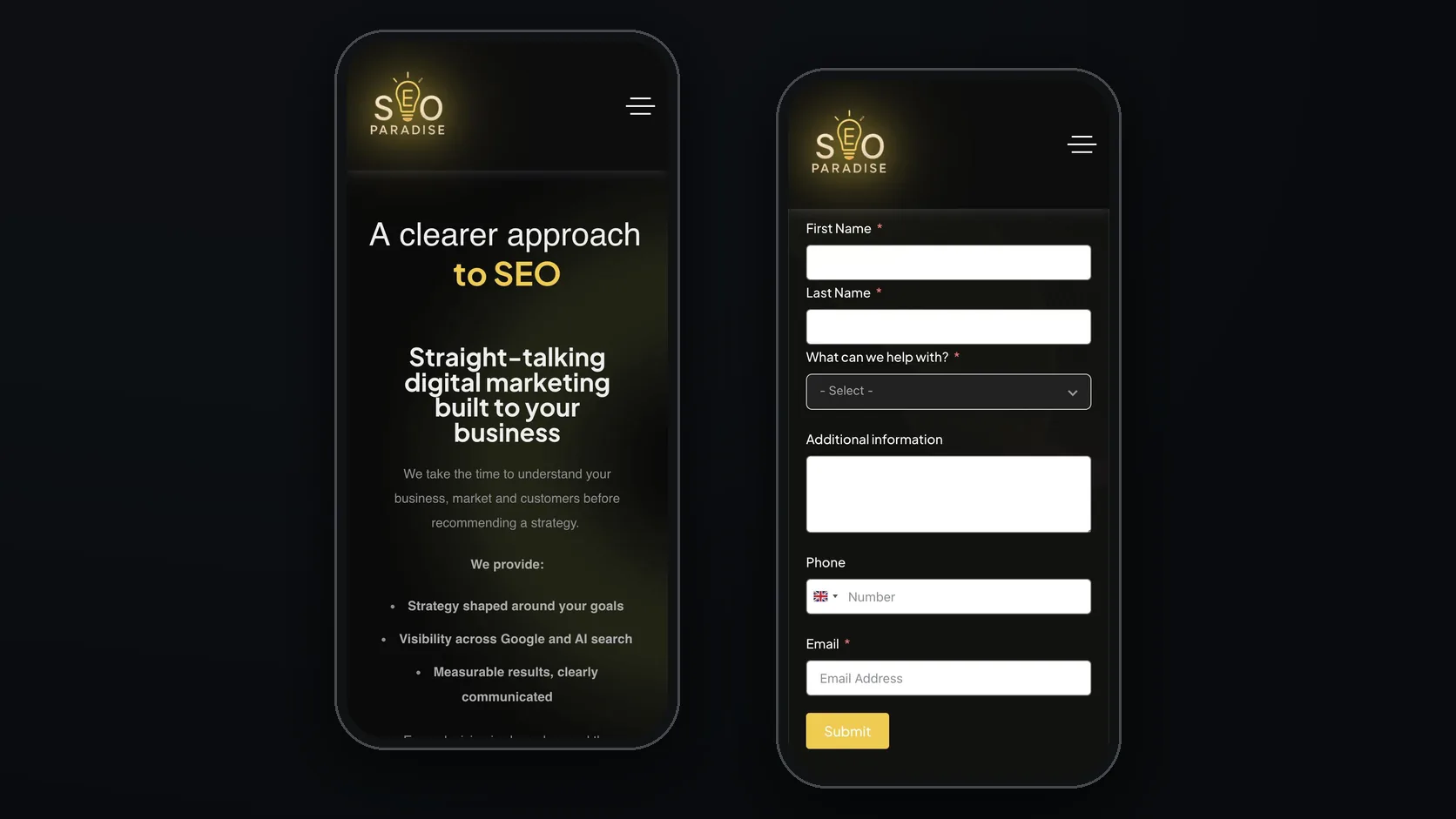
The SEO Paradise website is built around credibility and a quick route to enquiry. Each core service — web development, search engine optimisation, and analytics and growth tools — has its own visual and a short explanation, and SEO plans are set out on their own cards.
We continue to manage the site. On shared client projects, each agency delivers its own part of the brief, so we don’t present those projects as ours alone.
What we delivered
One visual per service
Web development, SEO, and analytics and growth tools each get their own 3D visual and a short explanation.
Plans on their own cards
SEO plans are set out as separate cards, so they are easy to compare on a phone.
A working partnership
We manage the site and collaborate on selected client projects, with each agency delivering its own part.
Project imagery
More work
See all client work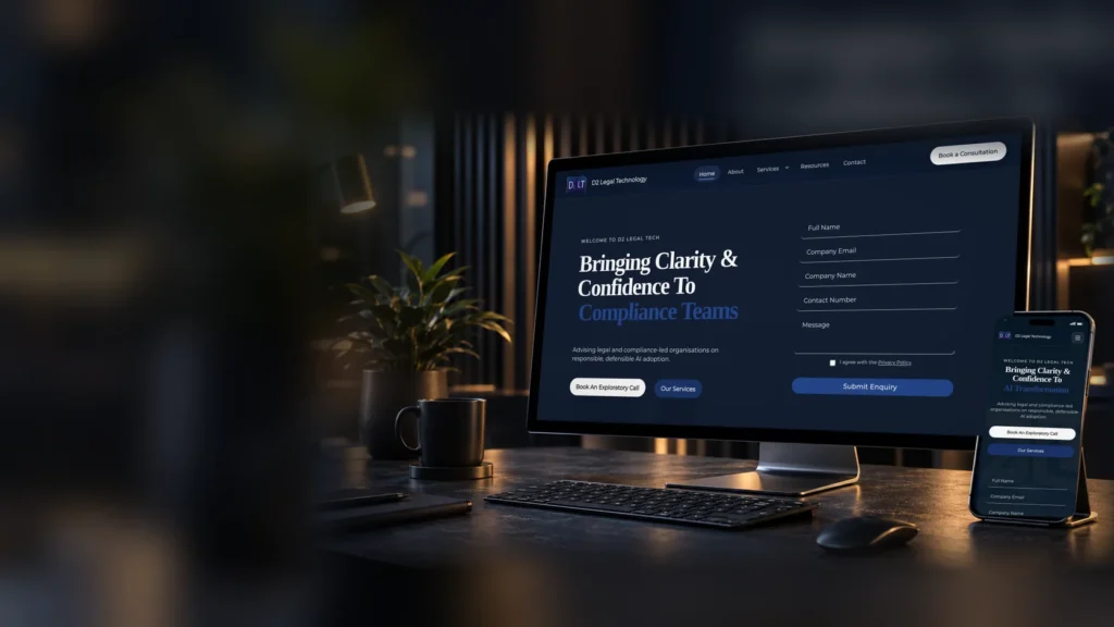
D2LT AI
We designed and rebuilt the site, and now host and manage it. Each advisory service has its own page, with a short enquiry form beside the headline.

Volition
Designed and built by us, with separate first steps for hiring firms and candidates.

SEO Paradise
We built and manage their website, and work alongside them on selected client projects.
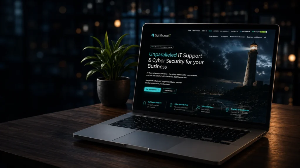
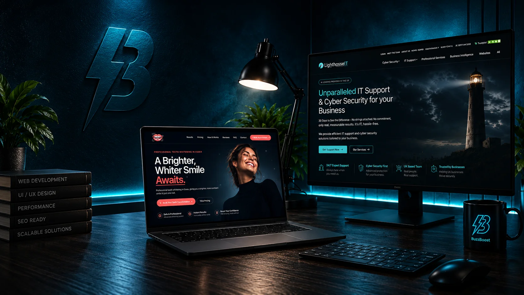
Lighthouse IT
An ongoing partnership: we manage, design and develop websites across the sites Lighthouse IT looks after.